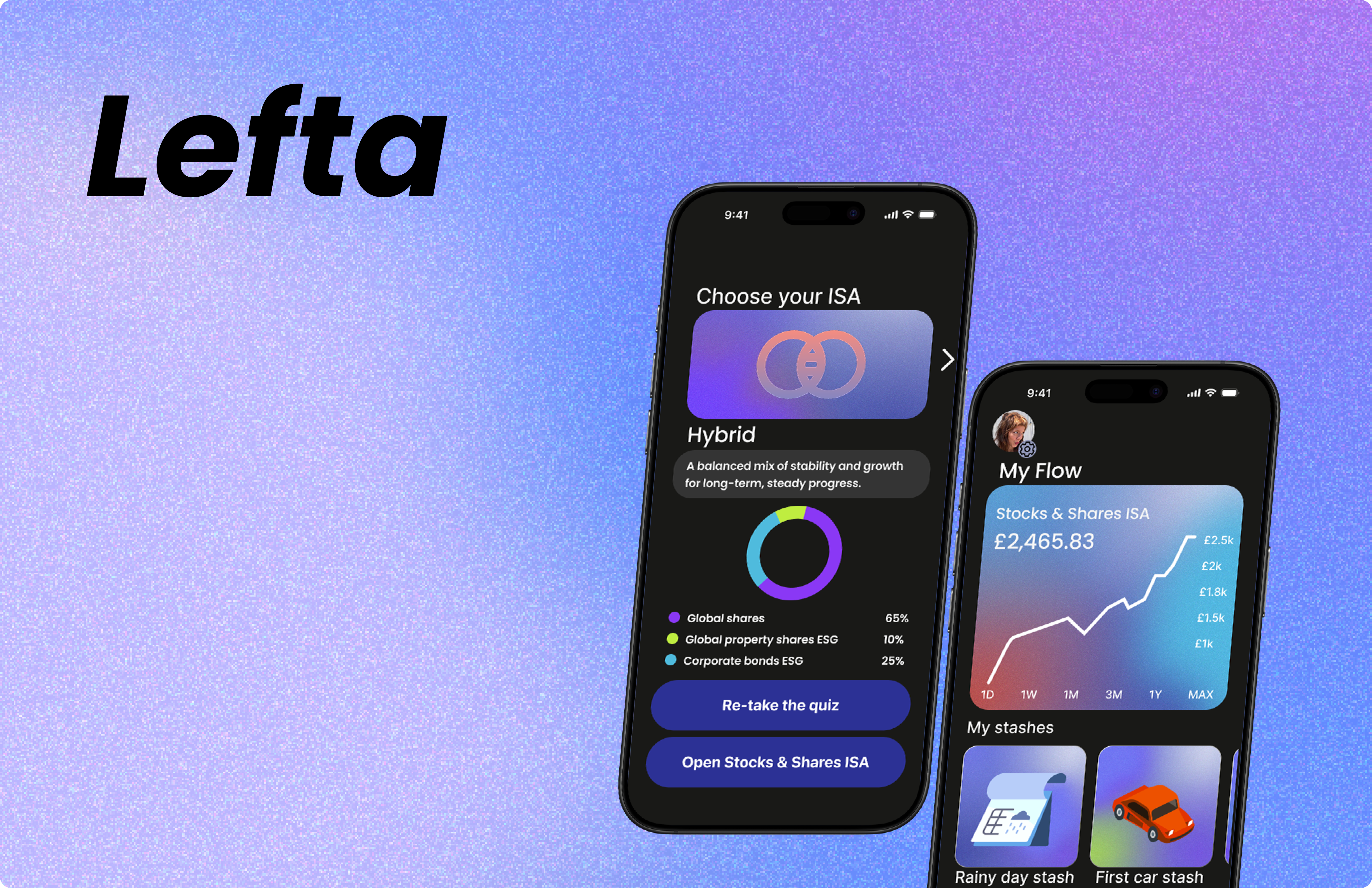
Lefta Wealth
Investment and Savings App
A Stocks & Shares ISA app that makes investing feel clear, personal and achievable for 18–30 year olds.
Background
This project was a design challenge set by Barclays for students of the MSc UXID course at Glasgow Caledonian University. The brief was to design a new mobile banking app for 18 to 30-year-olds.
Problem
Lefta Wealth is a global wealth management bank with over 100 years of heritage and a reputation built on trust. But its digital offering hasn't kept pace, and it's struggling to attract younger customers.
How can Lefta Wealth's trusted name and heritage be translated into a modern mobile experience that earns the confidence of a younger generation?
1 / Discover
Overview
- Client
- The demographic
- Heuristic evaluation
- Competitor reviews
Client
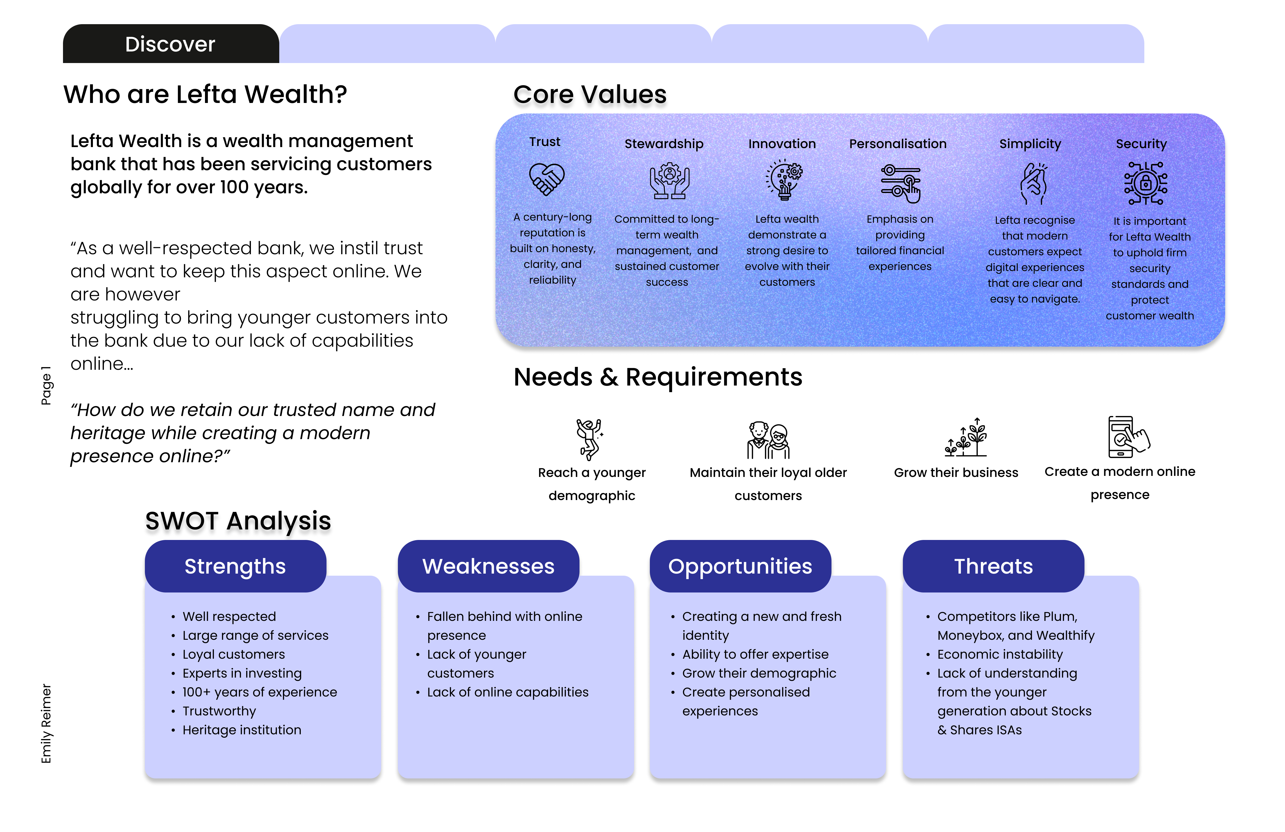
Lefta Wealth has been a trusted name in wealth management for over 100 years, but it has fallen behind online. A SWOT analysis showed its strengths are heritage, expertise and loyal customers, while challengers like Plum, Moneybox and Wealthify are winning over younger savers.
Demographic
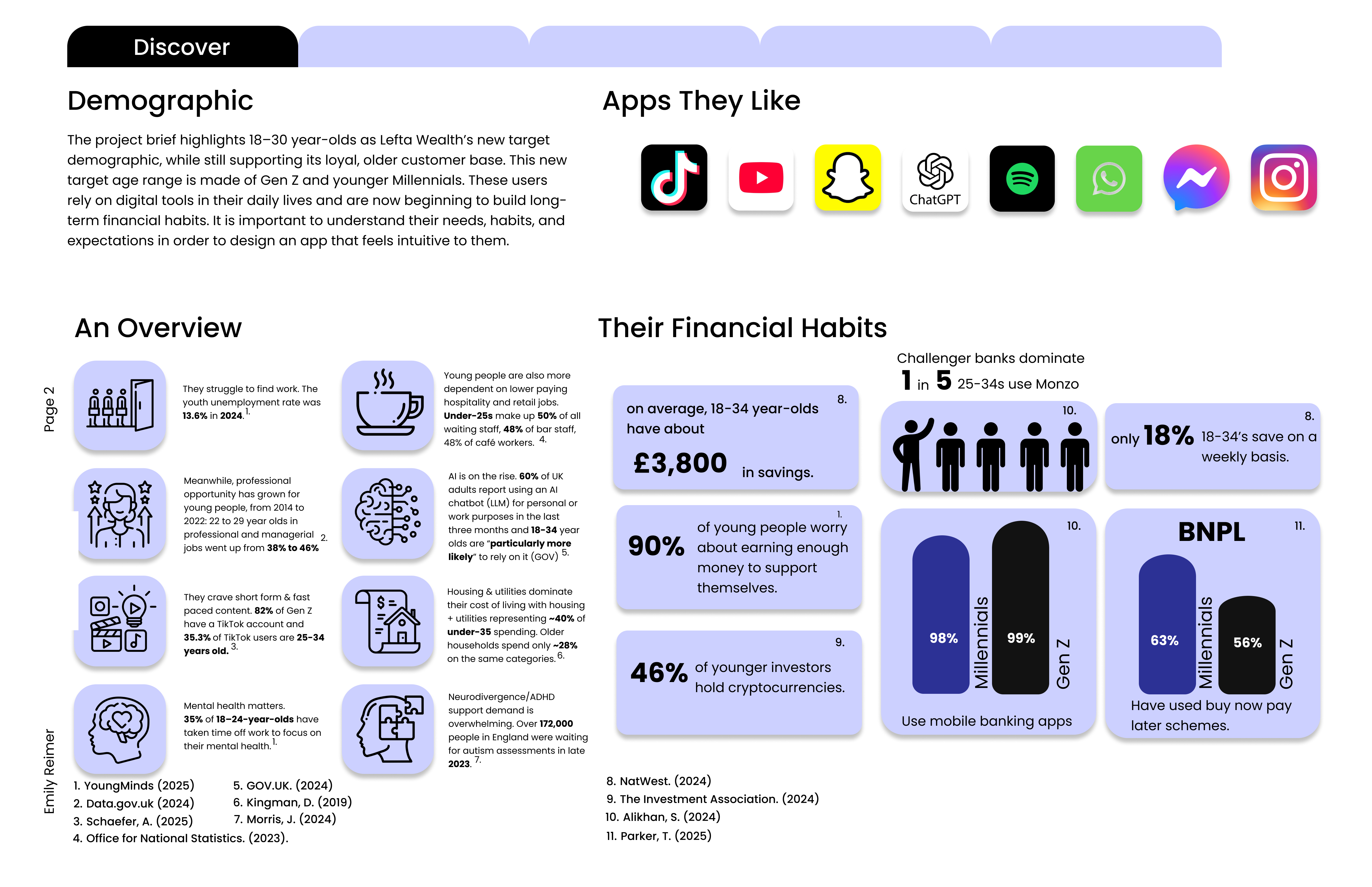
The brief targets 18–30 year olds: Gen Z and younger Millennials who live on their phones and are just starting to build financial habits. Many are juggling low-paid, high-demand jobs while the cost of living rises.
Heuristic evaluation
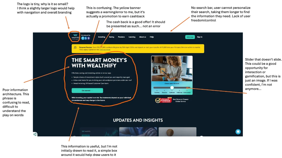
I ran a heuristic evaluation and usability test on Wealthify’s homepage. Users spent too long scrolling, had no search bar to fall back on, and kept trying to click things that weren’t interactive.
Competitor reviews
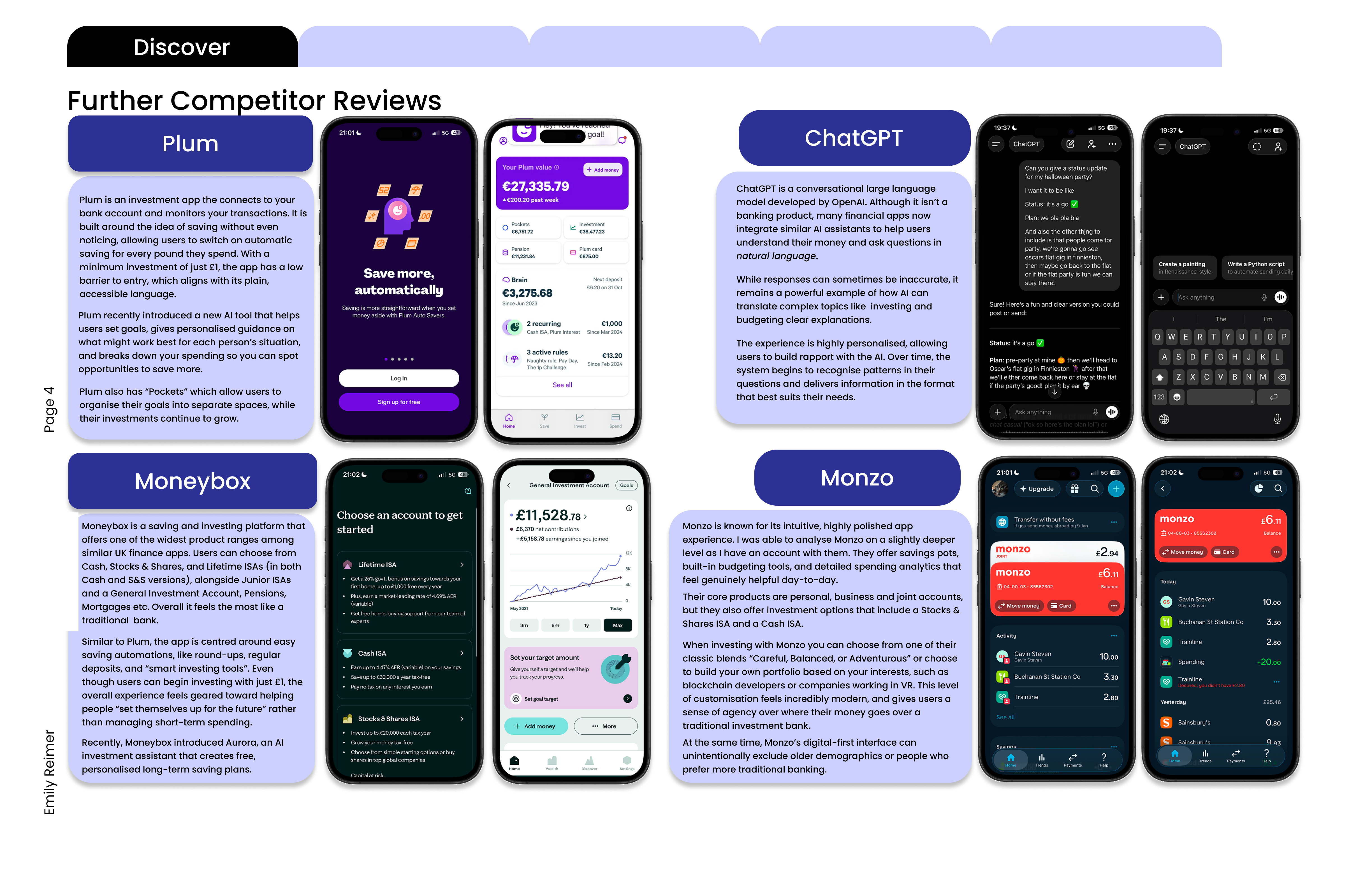
I also reviewed Plum, Moneybox, Monzo and ChatGPT. The patterns that stood out were savings pots, low minimum deposits, a high level of personalisation, and AI assistants that explain money in plain language.
2 / Define
Overview
- Empathy maps
- Personas
- Point of view and How Might We
- Kano and MoSCoW
- Design brief
Empathy maps
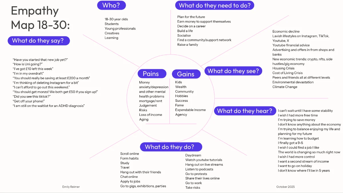
Most of the 18–30s I researched are incredibly hard-working. They feel like they should be saving but genuinely don’t know where to start, and many are navigating ADHD or autism. They need tools that feel simple, forgiving and intuitive.
Personas
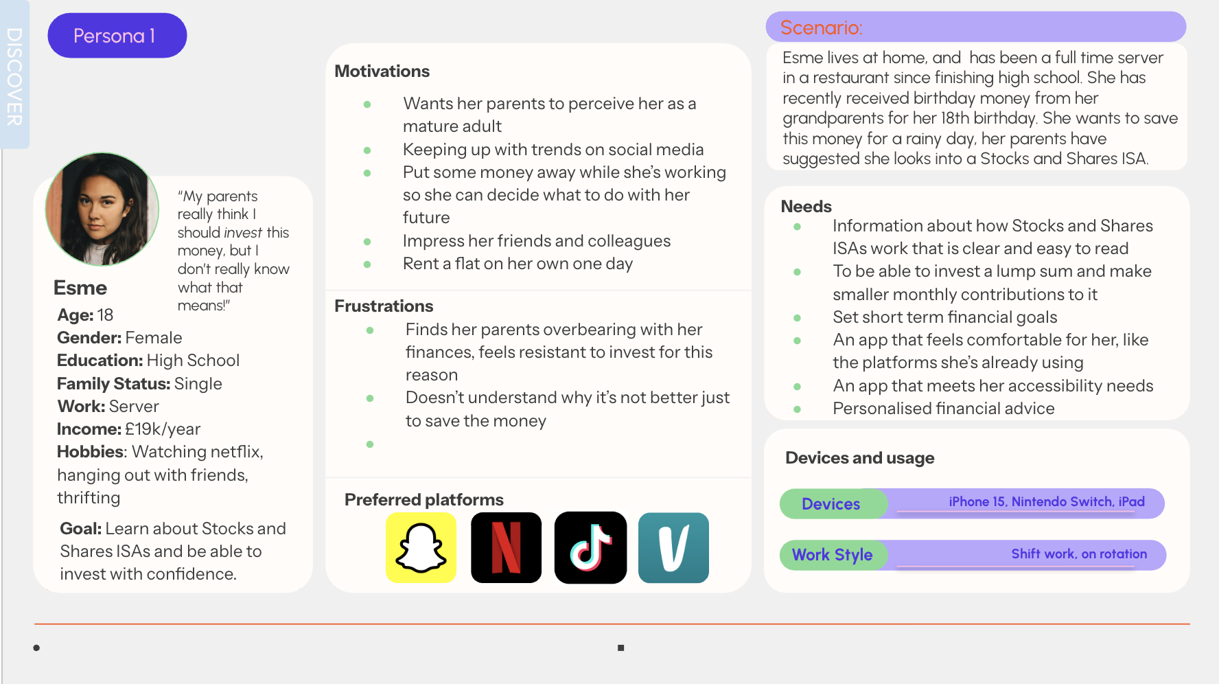
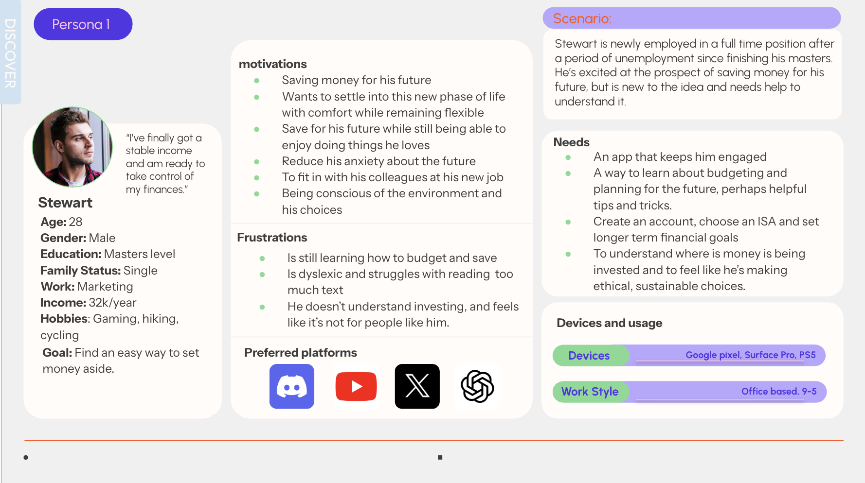
I created two personas: Esme (18) and Stewart (28), both are in different circumstances and both new to saving and investments.
Point of view and How Might We
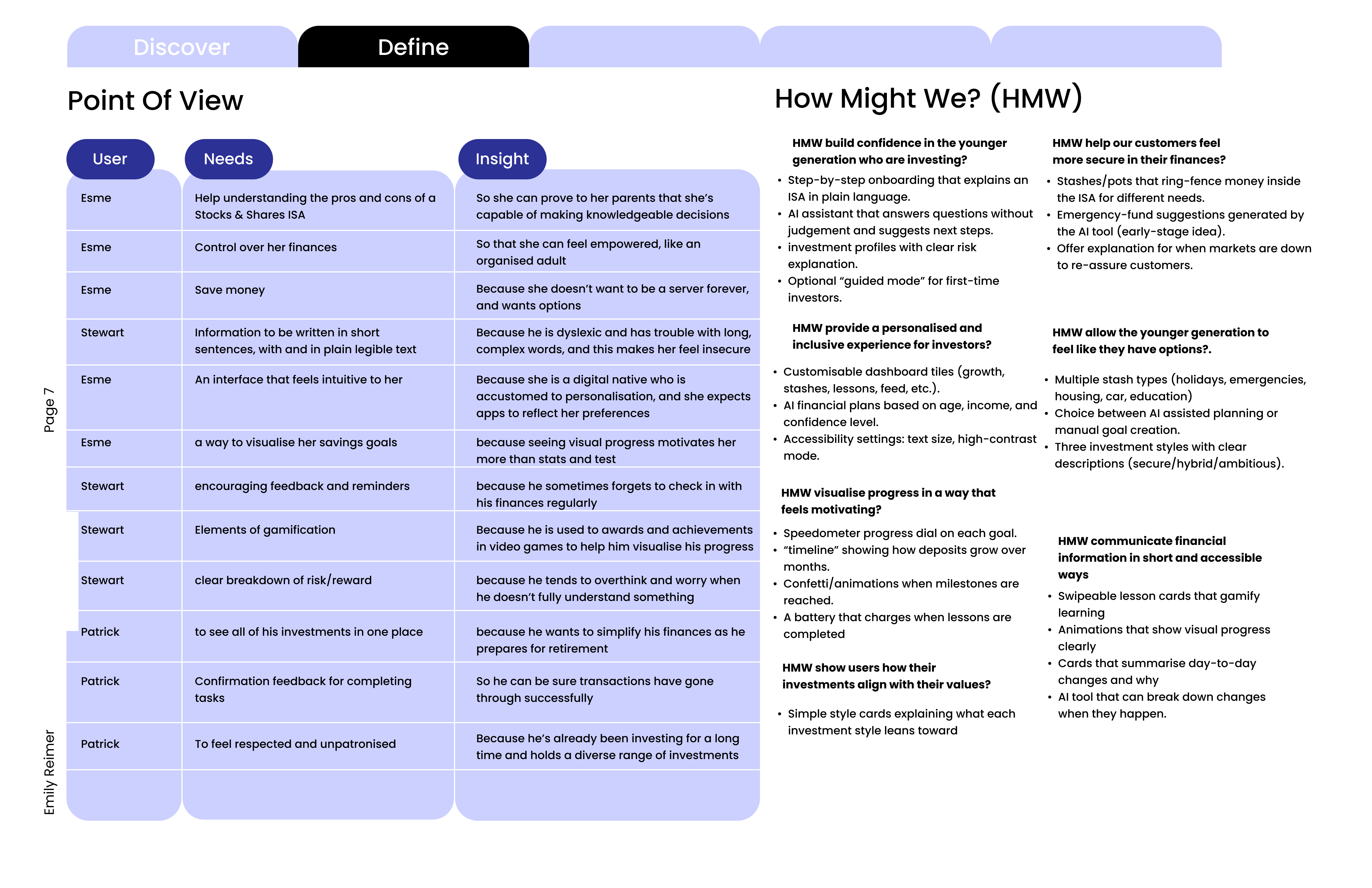
Point of view statements captured what each persona needs and why. I reframed these as How Might We questions, such as “HMW build confidence in the younger generation who are investing?” and “HMW visualise progress in a way that feels motivating?”
Kano and MoSCoW
I mapped potential features on a Kano diagram, using my competitor reviews to benchmark what users now expect, then prioritised them with MoSCoW.
Design brief
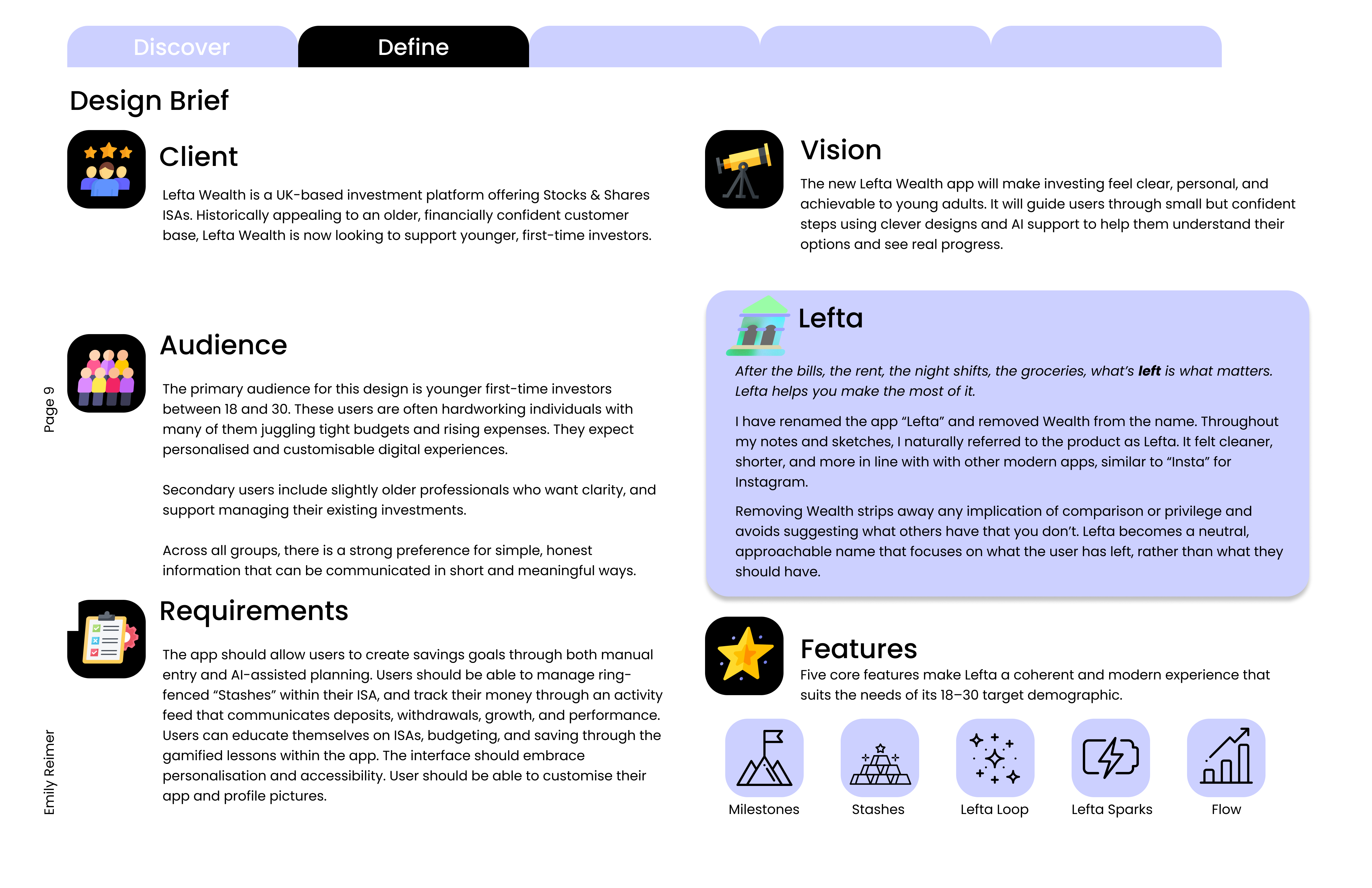
This led to the design brief, and a new name. I dropped “Wealth” and renamed the app Lefta: shorter, more modern, and focused on what the user has left rather than what they should have.
“After the bills, the rent, the night shifts, the groceries, what’s left is what matters. Lefta helps you make the most of it.”
3 / Develop
Overview
- Crazy Eights
- Information architecture and user task flows
- Wireframes and user testing
- Style tile and UI
- Final user testing
Crazy Eights
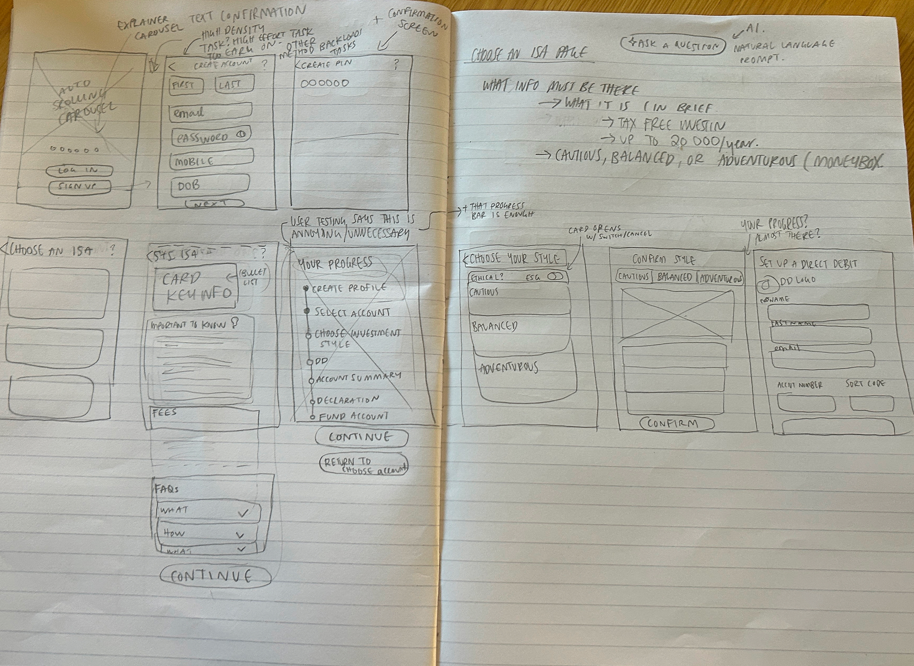
I kicked off ideation with Crazy Eights to rapidly explore layouts and how the main features might flow together. Some of these sketches were even used in early user tests.
Information architecture and user task flows
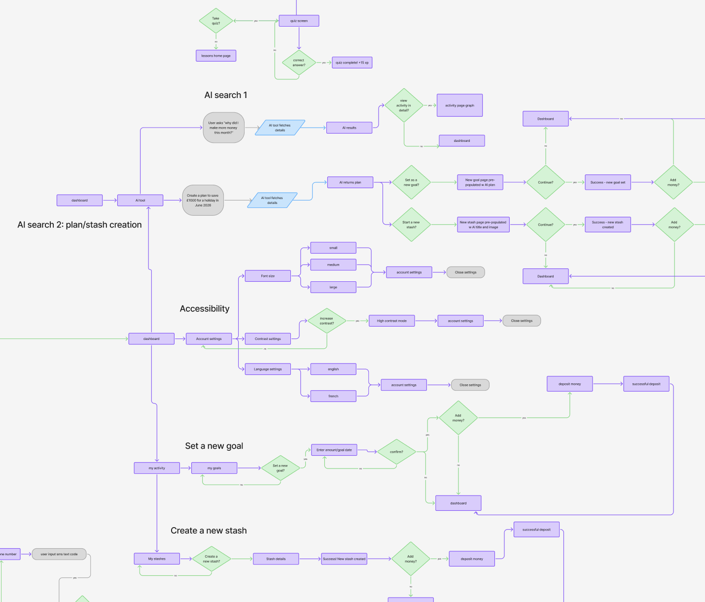
My sketches fed into user task flows and the information architecture. One big takeaway was how many routes there can be into a single part of the app, like the activity dashboard.
Wireframes and user testing
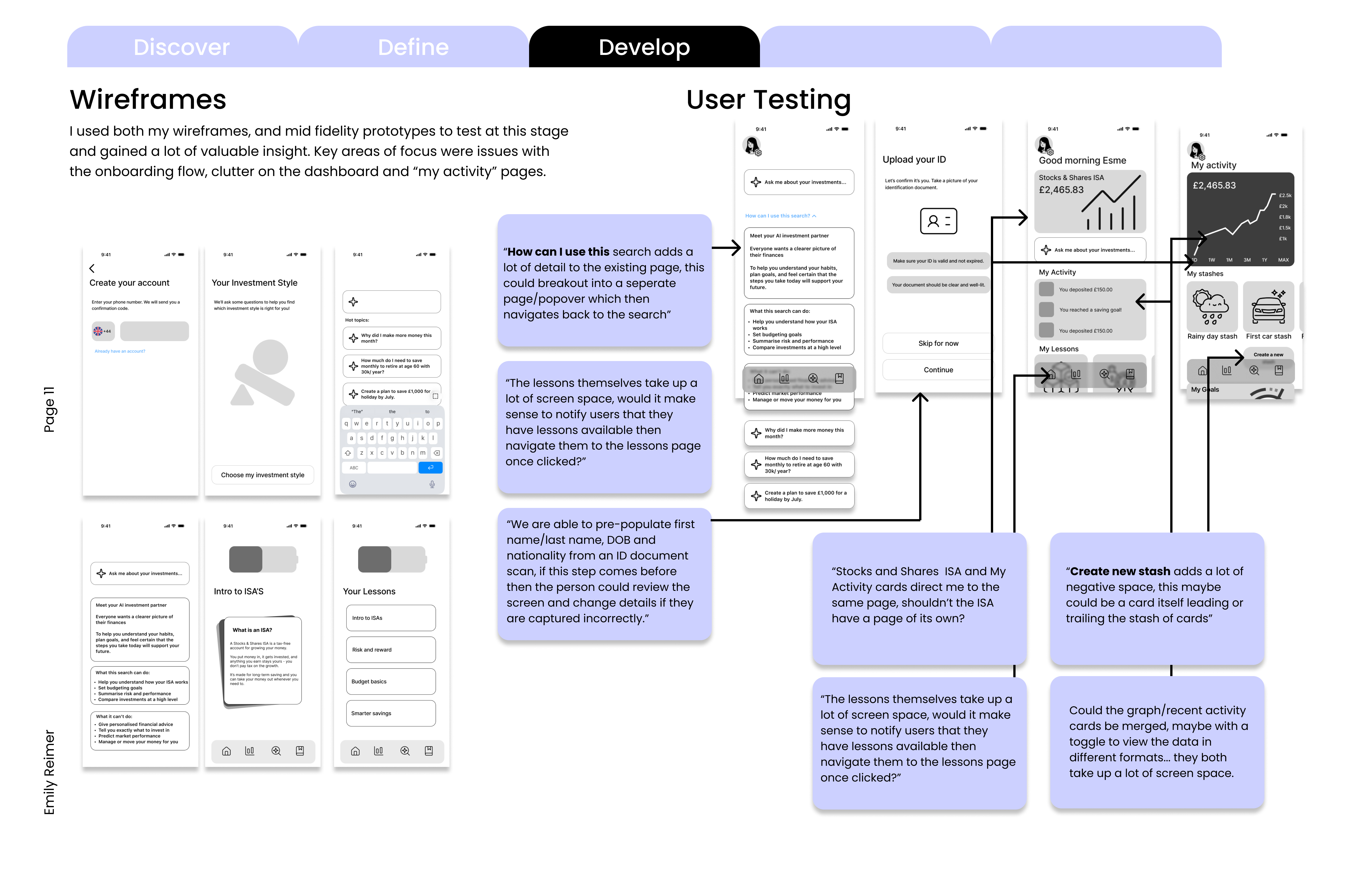
I tested wireframes and mid-fidelity prototypes, which flagged issues with the onboarding flow and clutter on the dashboard and “My Activity” pages.
Style tile and UI
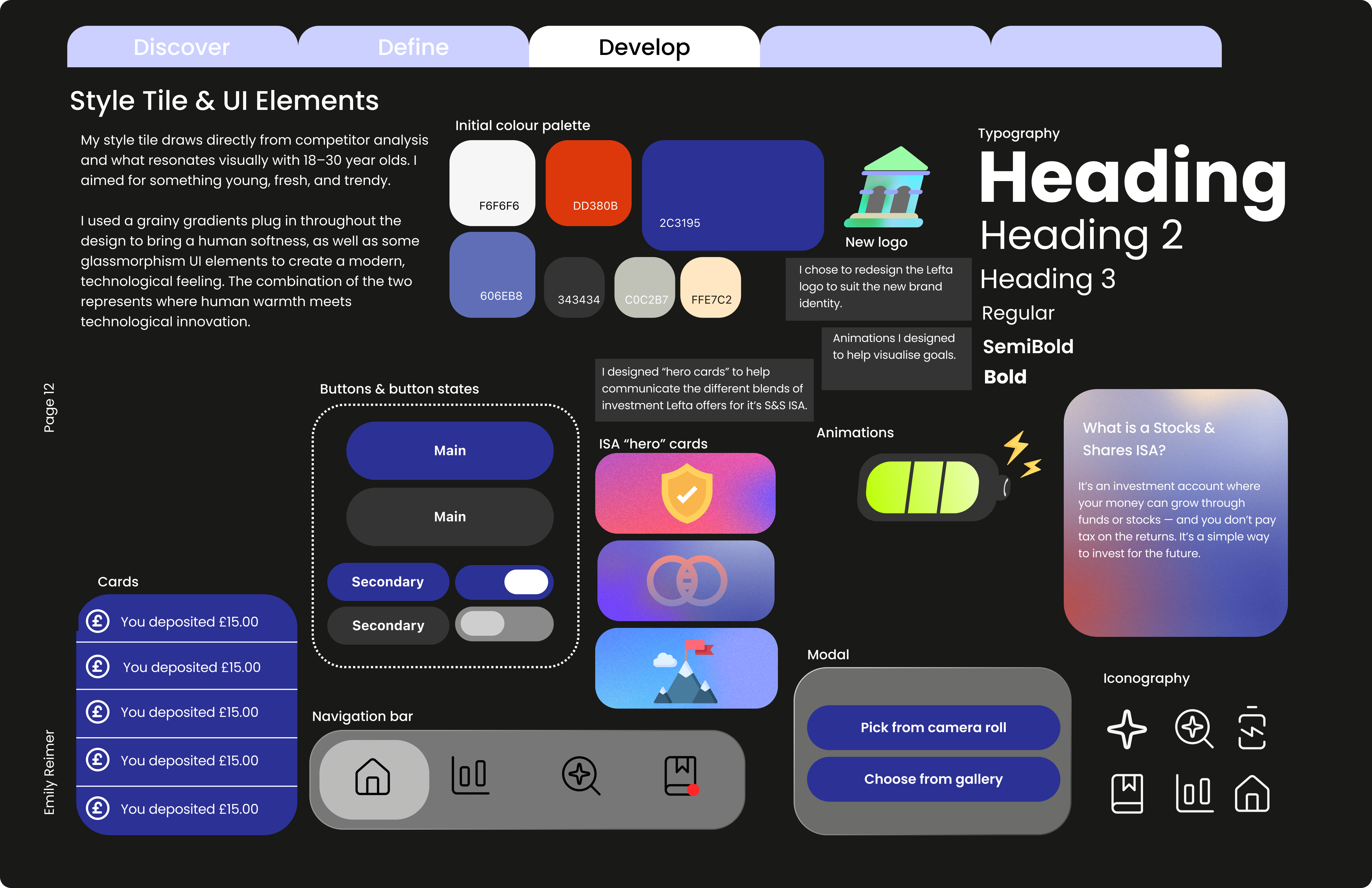
The style tile aims for something young, fresh and trendy. Grainy gradients bring a human softness, and glassmorphism elements add a modern, technological feel: where human warmth meets technological innovation.
Final user testing
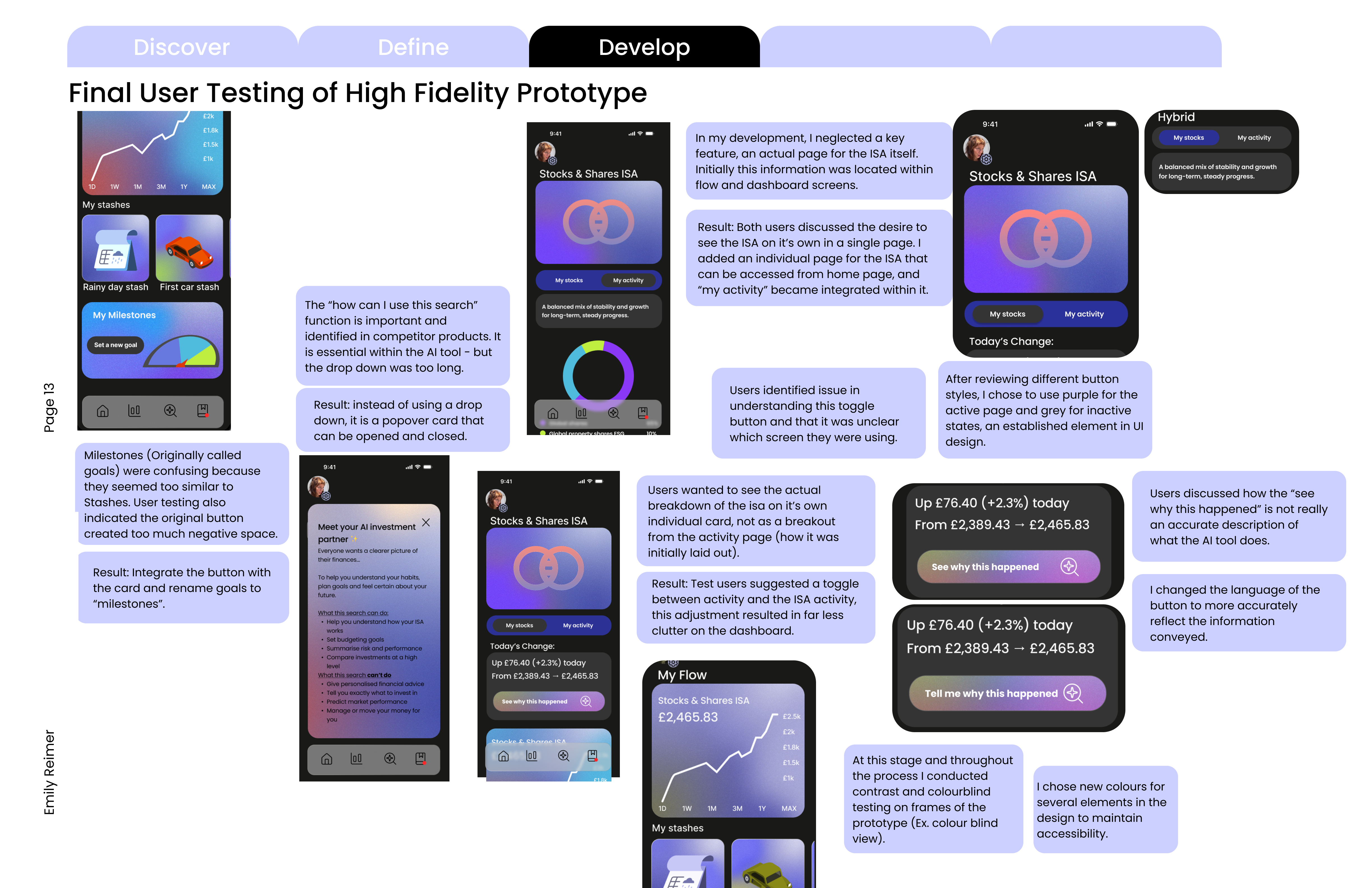
Testing the high fidelity prototype led to a few key changes:
- Goals were renamed “Milestones” so they didn’t feel too similar to Stashes
- The ISA got its own page, with My Activity integrated within it
- The AI search help became a popover card instead of a long drop-down
- “See why this happened” became “Tell me why this happened”
I also ran contrast and colourblind checks throughout, and changed several colours to keep the design accessible.
4 / Deliver
Overview
- Final design
- The 5 E’s of usability
Final design
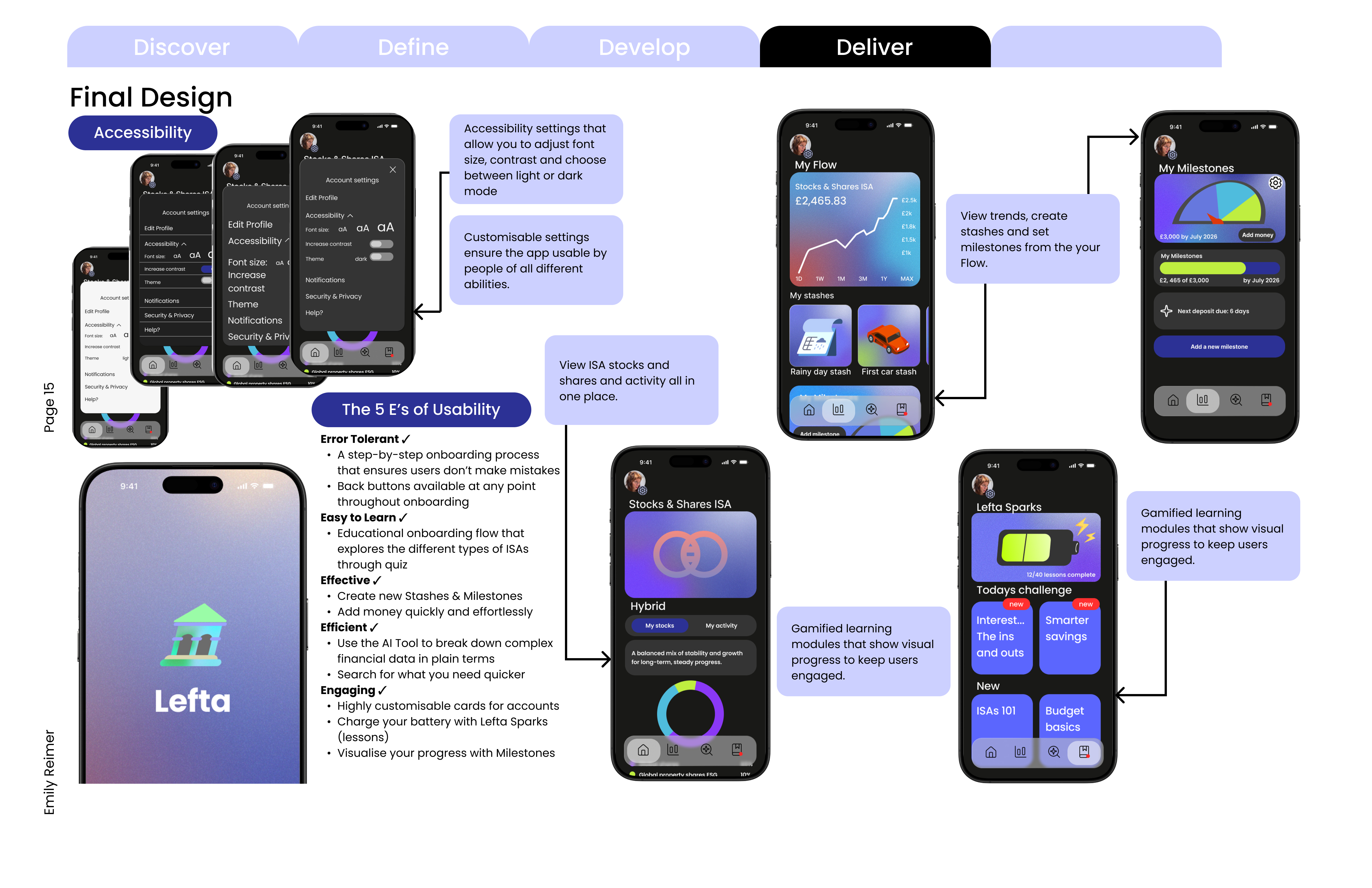
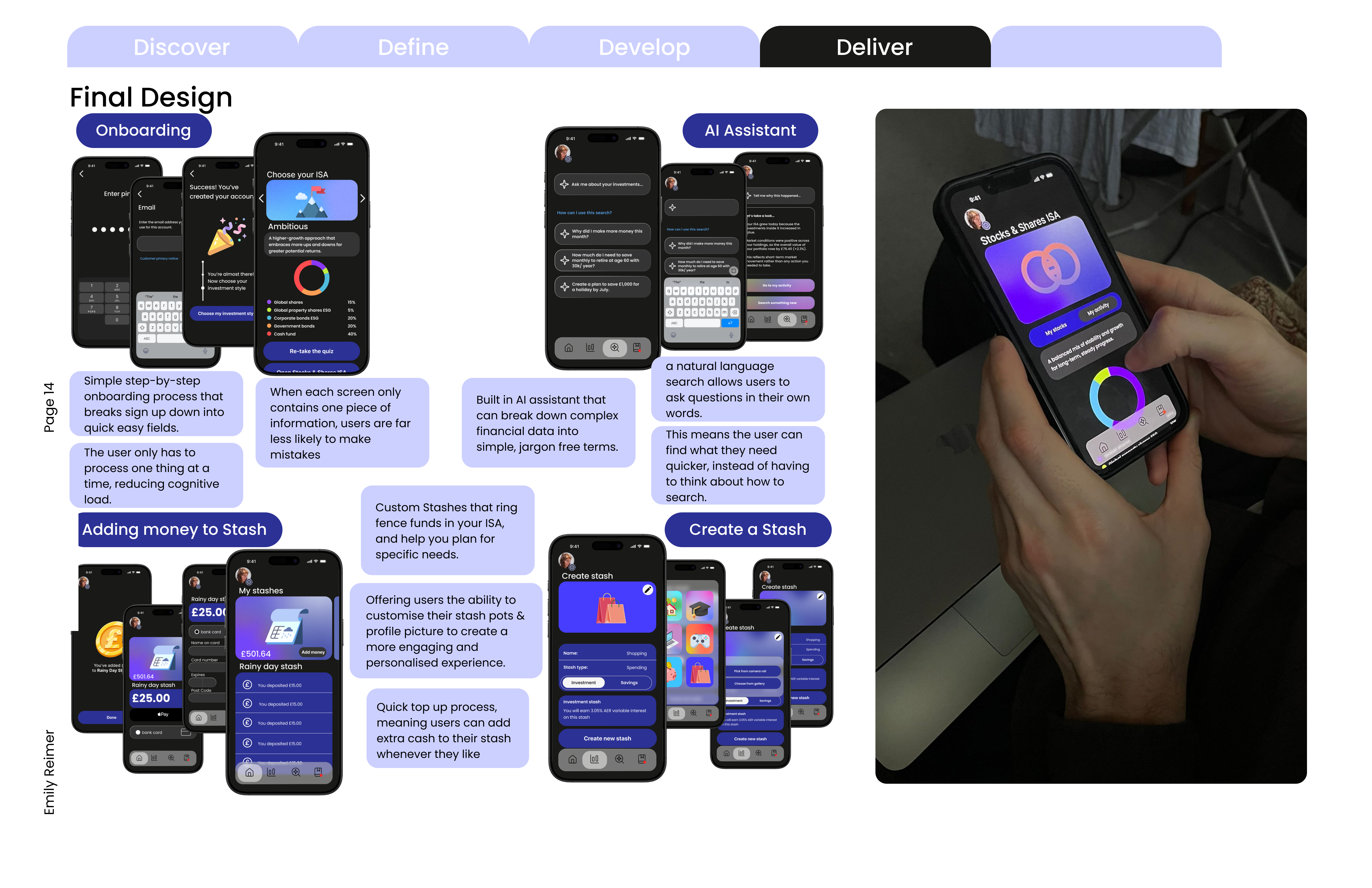
Lefta is built around five core features:
- Milestones are goals users set for themselves, with a progress dial to track how close they are
- Stashes work like Monzo pots, ring-fencing money inside the ISA for specific needs
- Lefta Loop is the AI assistant. It explains financial data in plain, jargon-free terms and lets users search in their own words
- Lefta Sparks are gamified learning modules, where a battery charges as you complete lessons
- Flow is the activity dashboard, showing trends alongside stashes and milestones
Onboarding breaks sign-up into one simple step at a time to reduce cognitive load, and accessibility settings let users adjust font size and contrast and switch between light and dark mode.
The 5 E’s of usability
The final design was checked against the five E’s: error tolerant, easy to learn, effective, efficient and engaging. Step-by-step onboarding with back buttons keeps it error tolerant, the AI tool makes it efficient, and customisable cards, Sparks and Milestones keep it engaging.